
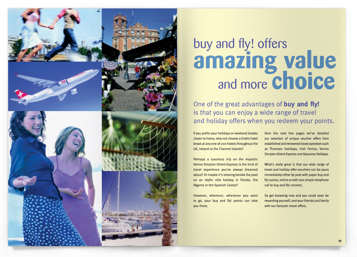
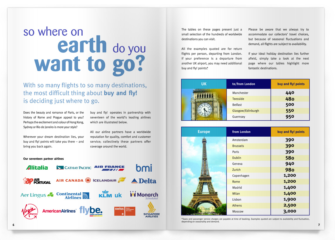
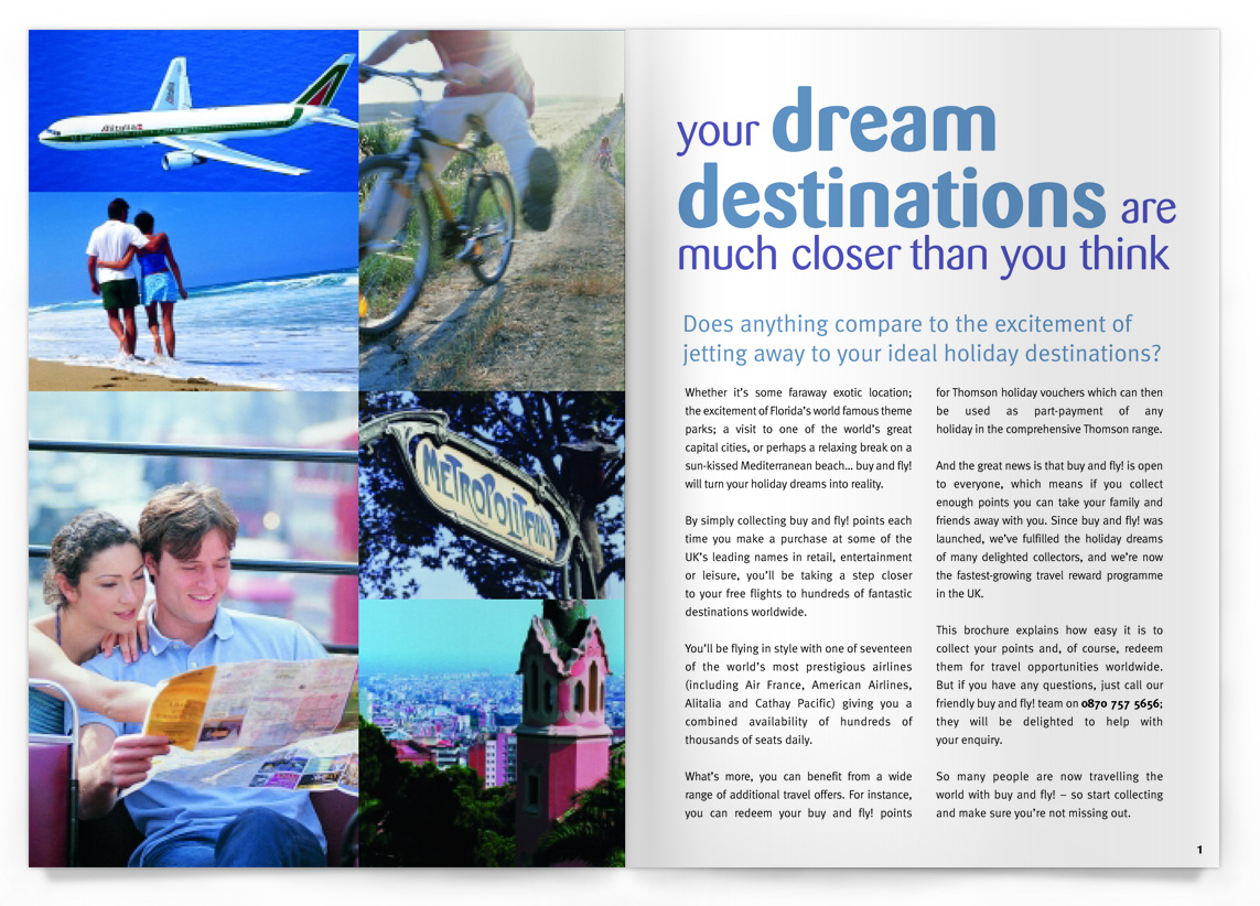
Above are the designs for the consumer brochure (similar to Airmiles, this targeted the consumer and showed them how they could spend the points they had accrued). Clean, fun and colourful with a strong grid for the imagery. The use of Barmeno as a friendly typeface worked well with the typographic styling of the text headlines.
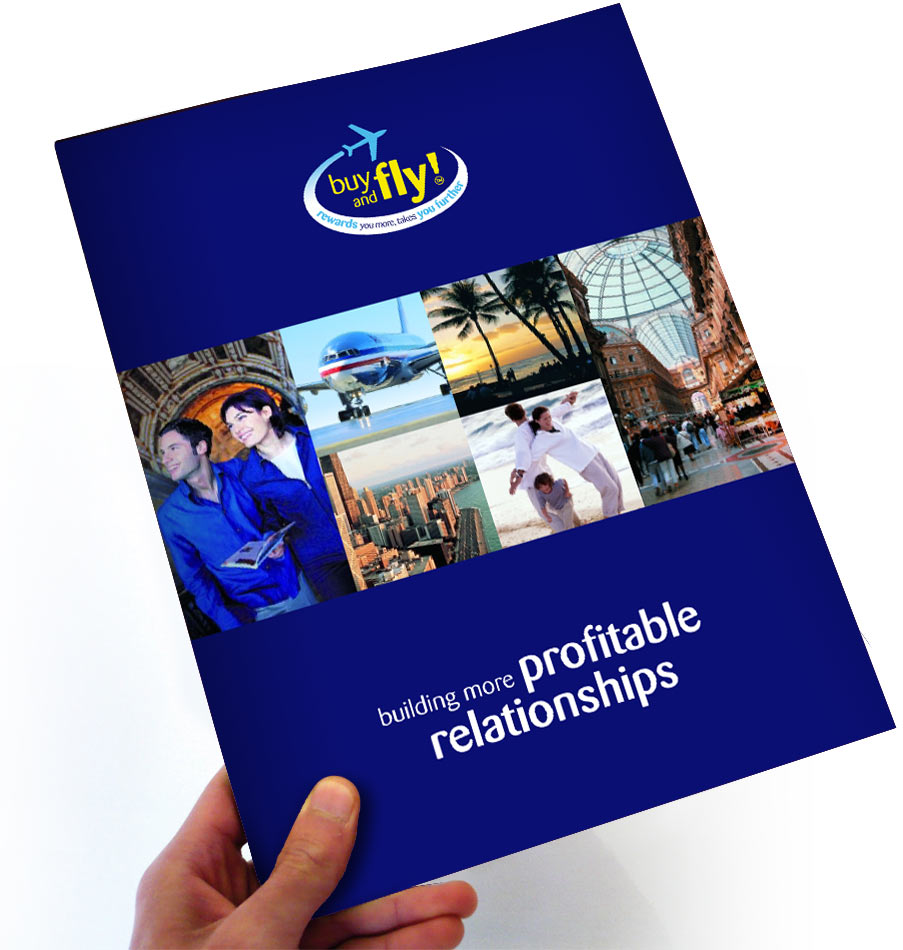
Below is the Corporate brochure which followed some of the design guidelines set in the consumer brochure (above) but made more use of the corporate blue colour way.

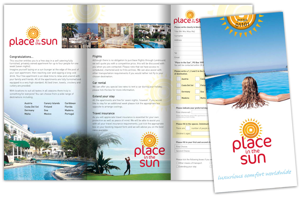
Above is one of the many ‘one off’ leaflets that were designed for partners of buy and fly! These often contained the redemption vouchers and details for the consumer.
For further examples of the brand identity click the relevant word to access the link.