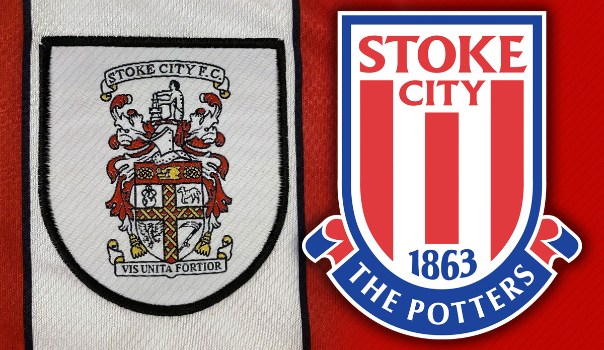
Stoke City FC and the Stoke City FC Academy crest design
- Category: Brand design
- Designed while at GVC
- A fantastic project to design was the rebrand and redesign of the Stoke City crest, which has radically moved them on from their previous crest ready for the media saturated market.
Stoke's existing crest was very long and based on the historic coat of arms of the city (slide 1), which was fine on a civic sign but for a forward thinking club they wanted their own identity. The existing identity was difficult to use owing to the detail on it, the example below shows how it had to be contained within an additional crest so it would work on a shirt, so simplicity and ease of use were the keys for the new crest design.
We toyed with ideas such as having some form of pottery within the crest (which later gave use the idea for positioning Sir Stanley Matthews within the crest for the Academy) but felt a simple, modern, fresh design that focused on the club's name, heritage, and nickname was the best route. Within the new media world it was important to be simple and legible (something their existing logo wasn't) and the new logo is certainly unmistakable now and works exceptionally well when used small scale (such as on mobiles or TV graphics) without loosing any of its impact.
| PETER DYKEAYLEN | GRAPHIC DESIGNER |


