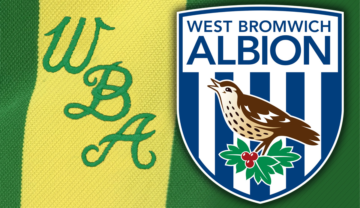
West Bromwich Albion FC crest design
- Category: Brand design
- Designed while at GVC
- A fantastic project to design was the rebrand and redesign of the West Bromwich Albion crest, which has modernised their previous crest ready for the media saturated market.
I worked as part of the design team on this identity and it was my last job for GVC, and a nice one to go out with!
WBA approached GVC wanting their crest to be redesigned. Based on an earlier crest design (middle) and combining the clarity and simplicity I really liked about the logo they had in the '70s (the basic WBA, on the yellow and green classic away kit) I concentrated on the word ALBION. I simplified the throstle design so that it would work in the new-media age where it would be used small on mobiles or spinning on SKY or Match of the Day.
| PETER DYKEAYLEN | GRAPHIC DESIGNER |


